With 1.59 billion daily active users, Facebook has become the hub for social media advertising, where companies and businesses can connect directly to their consumers. Unfortunately, it’s not enough for brands to simply post on their page anymore – it’s all about the ads.
It’s almost impossible to scroll through your Facebook newsfeed without seeing an ad – so it’s important to make sure your ads are optimized to reach the right audience, and are compelling enough to motivate an action.
While targeting, budget, and delivery are all extremely important to Facebook advertising, consumers only see the end result – the ad. Creative and copy drive users to act on your ad … or scroll on by. When jumping into the creative side of Facebook advertising, keep these four things in mind.
- Visual: Facebook algorithmically favors visual content, and consumers do, too. Whether it’s an image, video, or animated GIF, visually compelling creative is key to successful delivery.
- Relevance: If it isn’t relatable and relevant to your audience, users won’t act.
- Value: Your ads need to answer the question, “What’s in it for me?” Without a value proposition, consumers will keep scrolling.
- Call-to-action: This is the ultimate motivator; the consumer should know exactly what they need to do after looking at your ad.
With these points in mind, see how these 10 compelling ads from my Facebook newsfeed check all the right boxes.
Allbirds
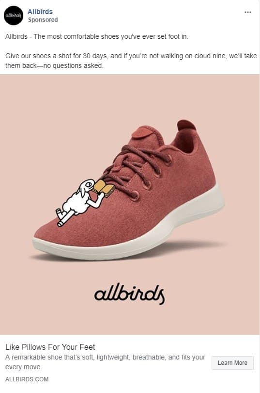 Why I love it: Simple, yet significant. This ad perfectly demonstrates the adage, “Less is more.” The consumer knows what the product is without even reading the copy. It puts the product in front of the consumer immediately. The ad copy elevates the creative a step further by speaking to the product’s features and benefits, presenting a clear offering. Each one is another opportunity to spark the consumer’s interest.
HelloFresh
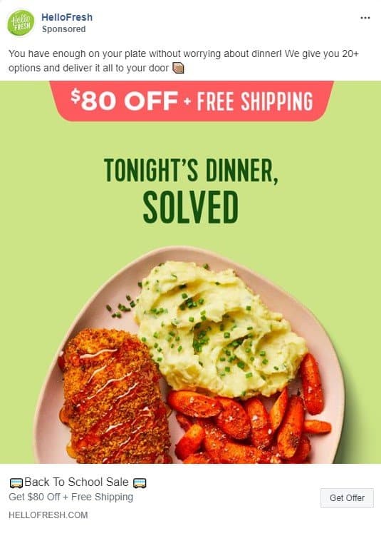 Why I love it: It’s relatable. One of the best ways to connect to consumers is by being relatable. HelloFresh states the value proposition simply: “Tonight’s dinner, solved.” We’ve all been there. We all know the struggle of planning and preparing meals ahead of time. This ad calls that shared experience to mind and provides the solution. Not to mention, the front-and-center promotion is a key motivator for consumers to take the next step.
Adobe Photoshop
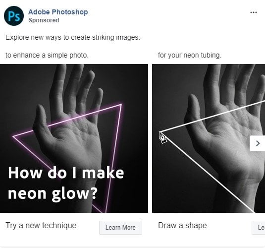 Why I love it: I’m a sucker for tutorials. Product demonstrations show consumers how the product works and can help them determine if it is worth their time and money. Adobe Photoshop can be a very complex program. This ad campaign works to counter that belief by sharing tips and tricks using Facebook’s carousel format as a unique way to give a step-by-step demo. It inspired me – I wanted to create something of my own.
Audi
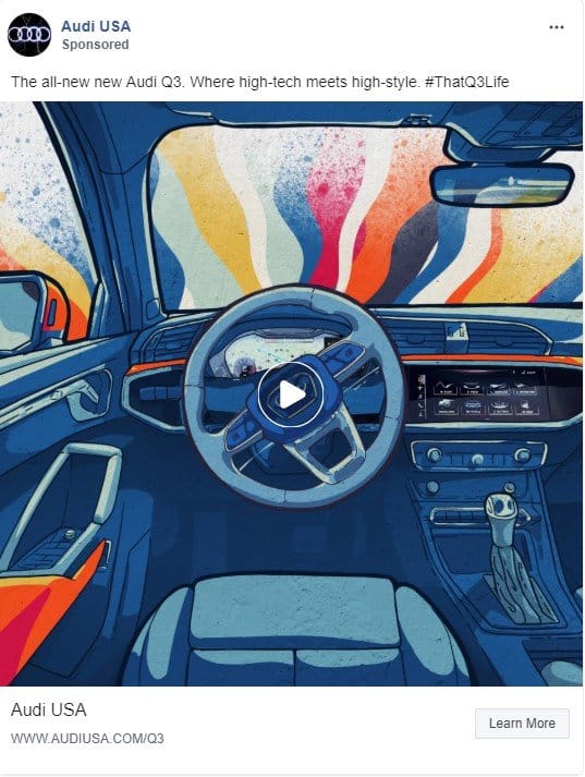 Why I love it: This was a thumb-stopper. It delivers visually stimulating creative from a brand you don’t typically associate with excitement. I was taken back when I realized this was one of their ads; it doesn’t look like the product-centric, glamour-photo Audi ads we are used to seeing. The eye-catching animated GIF entranced me. Honestly, I let it replay over and over again.
American Airlines
 Why I love it: This ad appeals to an interest I didn’t even know I had. American Airlines has successfully combined aesthetically pleasing photography and short, aspirational copy that gives you the itch to travel. Who wouldn’t want to visit Hong Kong after seeing this image?
Adobe Stock
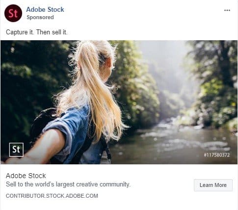 Why I love it: With Facebook’s changing interface and shrinking ad space, it’s important to remember to keep ad copy short and informative to keep consumers interested. Copy is the star of this ad. It’s a solid one-liner that checks all the boxes on my list. Whether or not you already know what Adobe Stock is, t’s clear after seeing this simple ad.
Birchbox
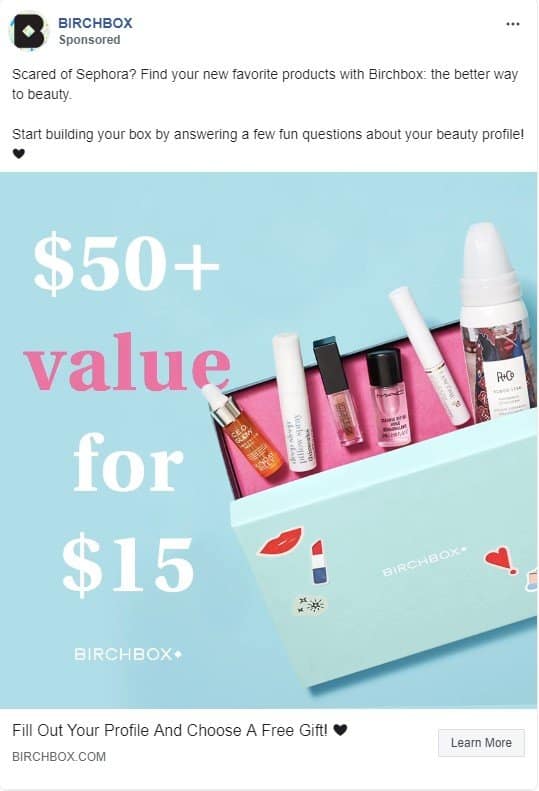 Why I love it: Product. Price. Promotion. Consumers know exactly what they are getting into after viewing this ad. Any one of the several offerings could motivate a lead or even a purchase. The temptation to get a free gift for filling out a profile is especially smart – it’s easy, low commitment, and can be extremely valuable for remarketing.
Capital One
 Why I love it: This ad does a great job of leaving room for interpretation. Credit cards are often seen as a stressful and overwhelming product, but this campaign focuses on a light-hearted benefit – cashing in your quickly accumulating travel miles for family joy. It provides just enough information about their offer and prompts the consumer to answer a question that is relatable to them: “Where will your miles take you?” All made possible, by this credit card.
Boll & Branch
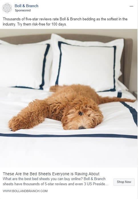 Why I love it: Well-deserved bragging rights. Use your good reviews and reputation to your advantage – and Boll & Branch does. Notice that their ad copy is short, but focuses on their great product and unique selling points. They also utilize the headline and description to share information about what sets them apart from their competitors. And come on, who doesn’t love an adorable pet picture that includes the product in use?
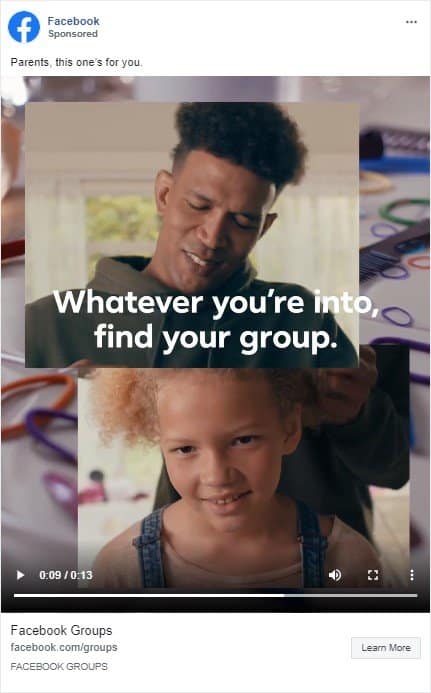 Why I love it: Facebook is doing what Facebook does best, making connections. Messaging is everything. The compelling video and copy in this ad are visual, valuable, and relevant in all the right ways. Use your creative and copy to connect to potential customers, and allow for your brand to resonate with them. Consumers want to feel connected to the brands they choose – give them a reason to.


