When advertising on Amazon, it is crucial to remember that your job isn’t done once you’re able to get potential customers to your Amazon listings. You need effective and interactive content on your product listings to not only encourage potential customers to add your item to their carts but also to prevent them from clicking away from your products to the competition during the decision-making process. A listing with great content is hard to click away from.
There are multiple ways that Amazon lets you add content to your listing. Here are three examples of good Amazon product listings and how they effectively utilize the tools at their disposal.
Edifier Bluetooth Headphones
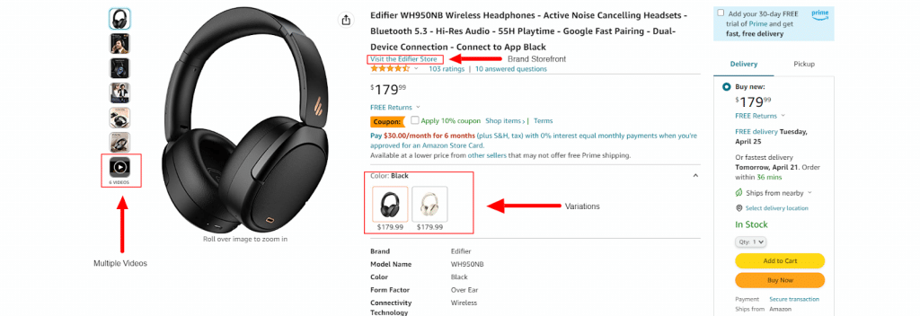
The electronics department is usually an excellent place to start when looking for examples of Amazon product listings with strong content. The first aspect I look for when scrolling through product listings is a detailed product title. A long title that lists multiple features is ideal for SEO and also establishes early on what features are available with this product. A short and to-the-point product title might seem like a good option, but it is actually better to be more descriptive of what the customer can expect if they were to purchase your product.
In this case, the title tells us that the headphones are Bluetooth and noise canceling and that they have Google Fast Pairing and Dual-Device Connection. That is all good information and could be some of the specific features that the customer is looking for when considering what headphones to buy.

Videos are always the second piece of content I look for on Amazon listings. If the listing has videos, they can be found on the left with the product images. I recommend uploading multiple videos if possible. Videos are a great way to go into more detail about the features of your product, and they give the customer an idea of what your brand is all about. The video section is also a great place to add any tutorial your product might have. Additionally, Amazon will add these videos to other product details pages of like products within your category, widening the number of shoppers you can reach organically.
The next aspect I’ll point out is that Edifier has built out a brand storefront on Amazon. A brand storefront is a great idea to add on Amazon for many reasons. The biggest advantage that the brand storefront has for the listing page is that it gives the customer the option to visit the Edifier Store, and Amazon puts that option right underneath the product title.
This accomplishes something that I highly recommend, and something I always try to personally do when helping out with product listings and/or product content, and that is making it harder for the customer to click away from your brand to go to a competitor. There are other ways to do this, and we will get into some of those ways, but having a brand store built out is a great way to keep customers looking at your brand and your products as opposed to competitors. Treat this as if it’s your own micro website on Amazon.
The next product listing we will look at is another great way to have the customer decide between many of your products and limits the opportunity for a competitor to get into the mix.
Nike Running Shoes
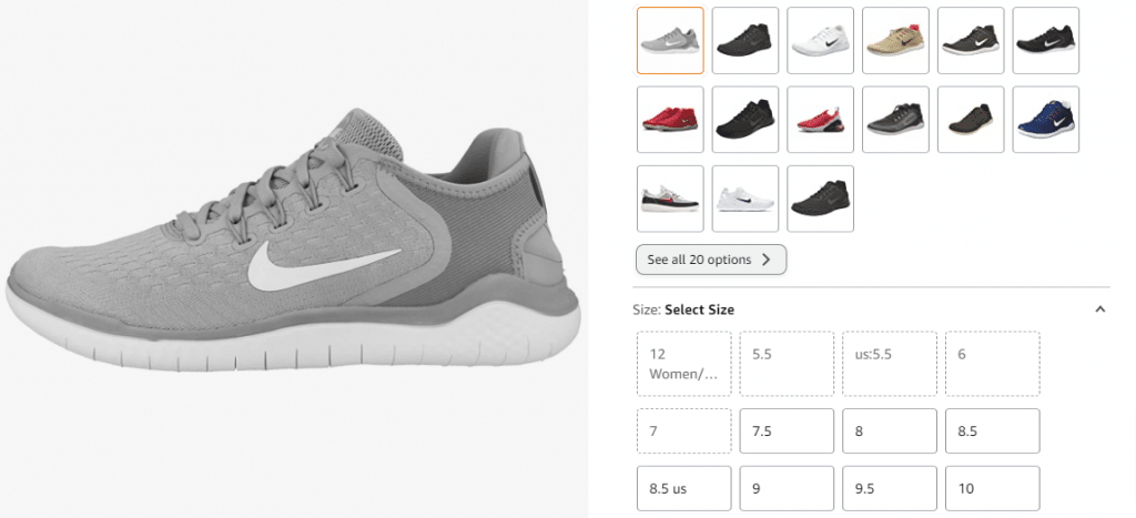
I’m using this Amazon product listing to illustrate the importance of showing all variations of your products if you have multiple size and color options. This is something that Edifier did with their headphones, and even if you only have two colors or size options, it is something that I highly recommend.
A customer looking for a different color and/or different size should not be a reason for them to click away from a competitor if you have the color and/or size they are looking to purchase. The apparel department is a great place to look for examples of this because there can be multiple different colors and sizes for the same product.

This is an extreme example of variations, but it is very effective. By creating a variation of this product and getting all of their color options to show on the page, the customer can decide they want a red shoe, for example. Then, they can immediately click on the red shoe option of this product. If this shoe didn’t have variations, and the customer decided they wanted a red shoe, they would probably search for red running shoes, which would make it much easier for them to land on a competitor’s shoe instead of a Nike shoe.
Samsonite Omni 2 Luggage with Spinner Wheels
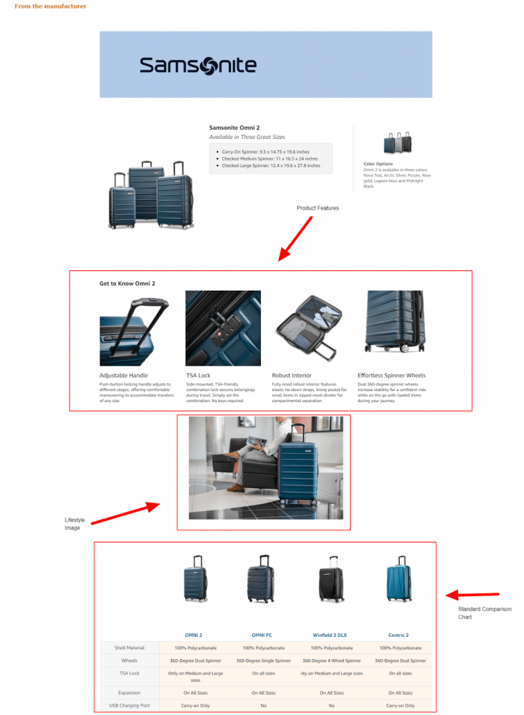
The last aspect I look for when examining Amazon listings is A+ Content or a Brand Story. You have to scroll down to get to this portion of the page, and it gives you the capability of doing everything that I keep coming back to. You can go into more detail about your brand and your product’s features here. This is also a great spot to add lifestyle images of your product to help the customer picture how the product fits into their lifestyle.
My favorite tool you get with A+ Content is the Standard Comparison Chart. This allows you to show multiple variations of your products as well as list product features for those products. This is a great example of having the customers compare and decide between multiple products from your brand and not let a competitor get in the way. Another great part of having A+ Content is that it pushes some of the carousel ads down the page, which again limits the possibility of a customer clicking away from your brand.

Amazon gives you multiple ways to build out an interactive and effective product listing. You should always strive to use these tools as best as you can. It is important to always be looking for ways to improve and generate more videos and images that can be incorporated into your product listing.
Your brand presence should be heavily felt on your Amazon listing as well by building a brand storefront, making A+ Content, and creating variations of your similar products to help keep customers focused on your brand, making it difficult for them to click away from a competitor.


