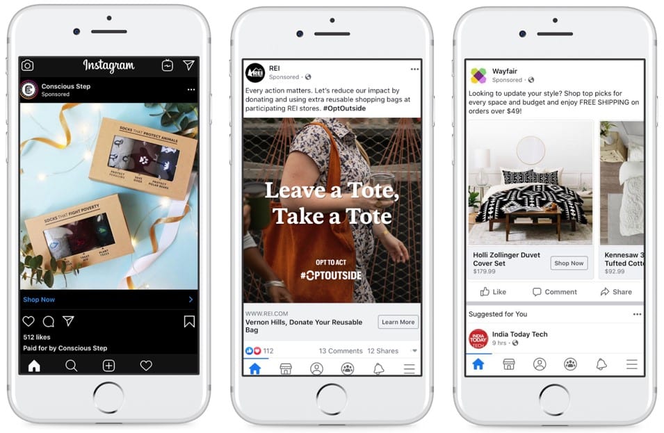
When advertising on Facebook and Instagram, your ads can be displayed in a variety of formats across a multitude of different placements. Facebook and Instagram are growing hubs of activity where ads tend to have high visibility. Another placement that is becoming increasingly popular is Stories. It’s important to optimize your ads for each of these prominent placements to maximize the user experience with your brand.
Because we live in such a fast-paced society, it is crucial that your ad stands out enough to make the user stop and look. Use this information to optimize your ads in both image and video formats.
Image Ad Best Practices
Condensing your message into just an image or two can be challenging. It is important to utilize the small amount of space you are given in the most effective way possible. Best practices for creating effective thumb-stopping static visuals include:
- Be Bold: Because images are static, it’s important to incorporate bright, eye-catching visuals. Adding stickers or frames to existing photos can be a simple way to liven them up for holidays and special promotions.
- Have a Clear Focus: If you are marketing a product, make sure the image clearly portrays the product and its details. Lifestyle images should be zoomed in enough that the viewer can identify the features of the product, while also being able to visualize how the product will look and feel in their own life.
Image Ad Creative Specifications
- Square Images: 1200 x 1200 pixels.
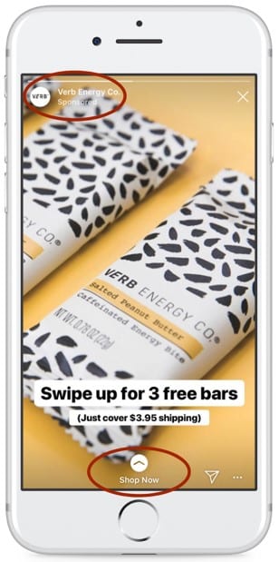
- Vertical Images: 1080 x 1920 pixels. This will be used for Stories placements. Since there is no additional ad copy for vertically-oriented images, it is important to include any pertinent call-outs as text overlay. Avoid adding any text or distracting visuals to the top left-hand corner and the bottom middle, as your brand name or call-to-action will be superimposed in those locations, as shown below.
- Image Types: Lifestyle images, product shots.
- Image Quantity: At least eight to 10.
- Logos: High-resolution 1080 x 1080 .png file with transparent background.
- Use Case: These will be used for single image ads, carousel ads, slideshow ads, and full-screen experience ads. That means the image may show by itself or be grouped with other images, so they should be able to work well aesthetically together and individually.
Image Ad Examples
Video Ad Creative Specifications
Video assets are optional, but strongly recommended.
- Square Video: 1200 x 1200 pixels with less than 20% thumbnail overlay.
- Vertical Video: 1080 x 1920 pixels with less than 20% thumbnail overlay. This will be used for Stories placements. As with vertical placements, avoid using any overlays or distracting visuals in the top left corner and bottom middle, as your brand name and call-to-action will automatically appear there.
- Editing Style: GIFs of different product styles, lifestyle shots, or stills with animated text overlay or background.
- Length: At least one variation 15 seconds or under. Longer, 30-second variations can be tested, as well.
- Resolution: Highest resolution possible, but with a file size no larger than 4GB.
- Thumbnails: Under 20% text (includes logos and other text overlays).
- File Type: Most file types are supported; however, we recommend H.264 compression, square pixels, fixed frame rate, progressive scan, and stereo AAC audio compression at 128kbps+.
Video Best Practices
- Branding: Showcase your brand, early and often. The first few seconds of your ad matter, a lot. The most effective mobile-first video ads include branding in the first three seconds and convey a brand’s key message in a quick, easy-to-understand and attention-grabbing way.
- Sound: Design for sound off, but delight with sound on. Successful videos designed for sound-off are visually delightful, with a clear focal point and a super-clear message. Yet 60% of global Instagram Stories ads are viewed with the sound on, so add an auditory experience to your ad as well.
- Attention: Every moment is a chance to capture attention. With audiences swiping quickly through their feeds, your brand must make a real impact in just a few seconds. Bring your most exciting frame to the front. People consume content 41% faster on their mobile News Feed than on their desktop News Feed, and recall content at a significantly higher rate.
- Time: Find the balance between the message and time. A mobile-first approach requires a different type of storytelling. Make your videos as short as they can be and as long as they need to be. But note: Shorter is better. Ads under 15 seconds work best in-feed, and the top-performing Stories ads are under 10 seconds in length.
- Framing: Build for where people are. Get playful with video framing and maximize the real estate mobile video allows. People use their phones vertically 98% of the time, so build ads to match how people consume content.
- Play More: Get out of your comfort zone and experiment. Top-performing mobile ads have an element of surprise. Introducing strong design elements may seem intimidating, but it can make ads more effective. Be creative and test, learn, and adapt.
Video Ad Examples
- Stories
- Story 1:
- Feed
-
- Feed 1:
- Feed 2:
-
By following the creative specifications and best practices outlined above, you’ll be able to make your brand pop on any placement, and in any ad format.


