The beauty industry has taken the world by storm. Women and men around the globe want to look good and feel good, and beauty brands help them do just that.
Around 96% of beauty brands use their social media presence to target the 3.5 billion social media users worldwide. They have seen that social media is a great way to generate brand awareness and drive product purchase.
Since the beauty industry is so saturated, how do brands stand out? It’s all about the ads.
These 10 captivating beauty ads demonstrate how to catch the consumer’s eye in a crowded feed.
1. Lancome
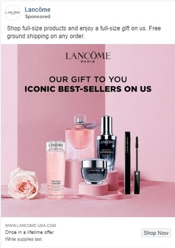
Why I love it: The color palette is simple and elegant. They display their best-selling products and offer a free gift right up front. “Free” is a magical word — everyone loves free perks!
2. Olay
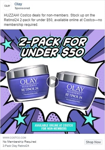
Why I love it: This comic-style image catches the eye right away. The two-pack deal is displayed in big, bold text right on top. You can’t miss it. Skin care products are expensive, so any deal you can find is a win. Olay’s ad capitalizes on that common perception.
3. Briogeo
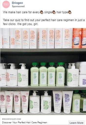
Why I love it: I love how the display of products is organized. It’s satisfying to look at. Beyond that, I love quizzes. Every person has a different hair type, and finding the right products can be a frustrating and expensive trial-and-error process. To help you find your perfect products, this Briogeo has created a quiz. It adds a fun element to what is typically a stressful buying experience. I would definitely click on this. In fact, I might take this quiz right now!
4. Burt’s Bees
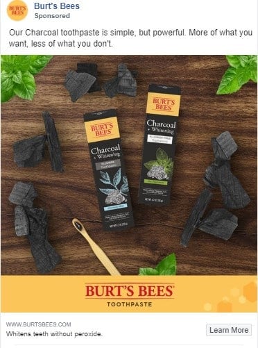
Why I love it: Natural ingredients are a big selling point for many people. In fact, organic and natural skincare ingredients factor into the buying decision for around 87% of Generation Z purchasers. The line that Burt’s Bees uses — “More of what you want, less of what you don’t” — is a perfect way to say everything they need to.
5. Olay
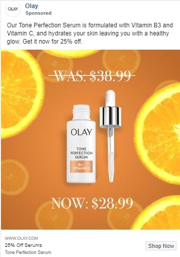
Why I love it: Here’s another from Olay. Like every ad in this list, it is very visually pleasing. Not only that, but it shows its selling point in three different places:
- The ad copy at the top says 25% off.
- The image shows the old price crossed out with a new price below it.
- The call-to-action text at the bottom also references 25% off
There is no mistaking that you are getting a deal here. Who doesn’t want a “healthy glow’” for a bargain?
6. eos
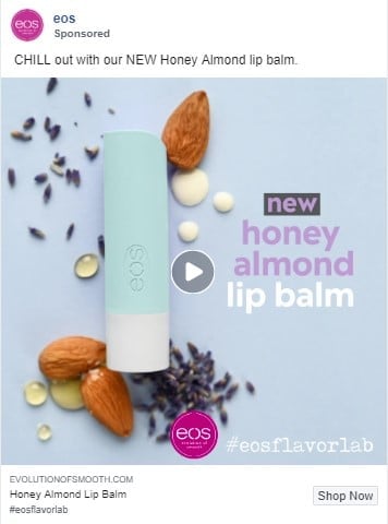
Why I love it: I’m a bit biased on this one because I love eos lip balms. The individual ingredients arranged around the product in the image stuck out to me the most here — especially the moisturizing drops of honey. You can also almost smell it as you take in the elements of the image. As someone who loves not only a good moisturizing lip balm, but also a good smelling one, I would buy this.
7. Laneige
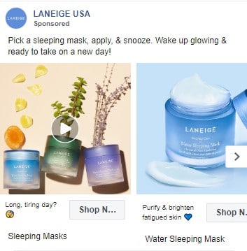
Why I love it: This ad speaks to feeling tired, and that is incredibly relatable. They are giving you a simple solution to wake up with fresh, glowing skin in the morning: Put the mask on at night and go to sleep. That’s it. People crave easy beauty regimens, and the promise of having a fresh, hydrated face doesn’t hurt either!
8. philosophy
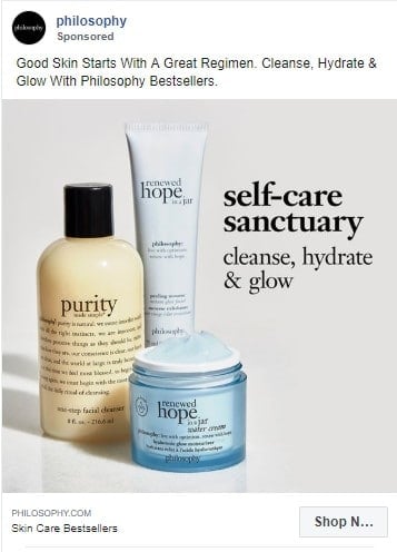
Why I love it: This whole ad reminds me of a spa. It makes me want to relax in my own “self-care sanctuary.” No one wants to spend hours searching for the perfect skin care product for each step in their regimen. This ad gives you three products designed to work together in three steps. Cleanse, hydrate and glow. Easy peasy.
9. Living Proof
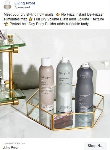
Why I love it: Living Proof products are gorgeous. The minimalist, modern look is very popular right now, and they took full advantage of that trend with this image. This ad, to me, is basically saying, “Do you want your bathroom to look like this? Buy our products.” And yes, I would love my bathroom to look like that! They also briefly explain each product in the ad text, so that when you shop you can quickly pick the best match for your hair type.
10. HUM Nutrition
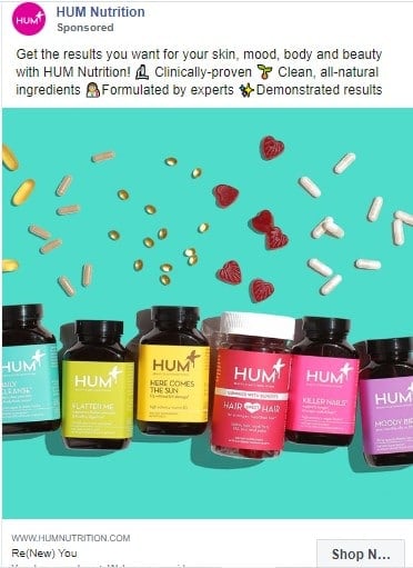
Why I love it: I don’t know how they do it, but they actually make vitamins look really pretty. It’s easy to forget to take your vitamins, trust me I would know. These attractive bottles with fun names like “Here Comes the Sun” give an exciting edge to taking vitamins. In addition, they let you know their ingredients are all-natural, checking another beauty trend box. There are multiple selling points here and I think HUM does an excellent job at displaying them.
In all of these ads, the winning elements boil down to a handful of key concepts:
- A clear, simple value proposition.
- Tapping into core human desires.
- On-trend visual assets.
Whether the appeal is attractive packaging, ease of use, or natural ingredients, these 10 beauty ads caught my eye with their striking visuals and on-point messaging. You can use them as inspiration for your next Facebook ad campaign — I will be!

